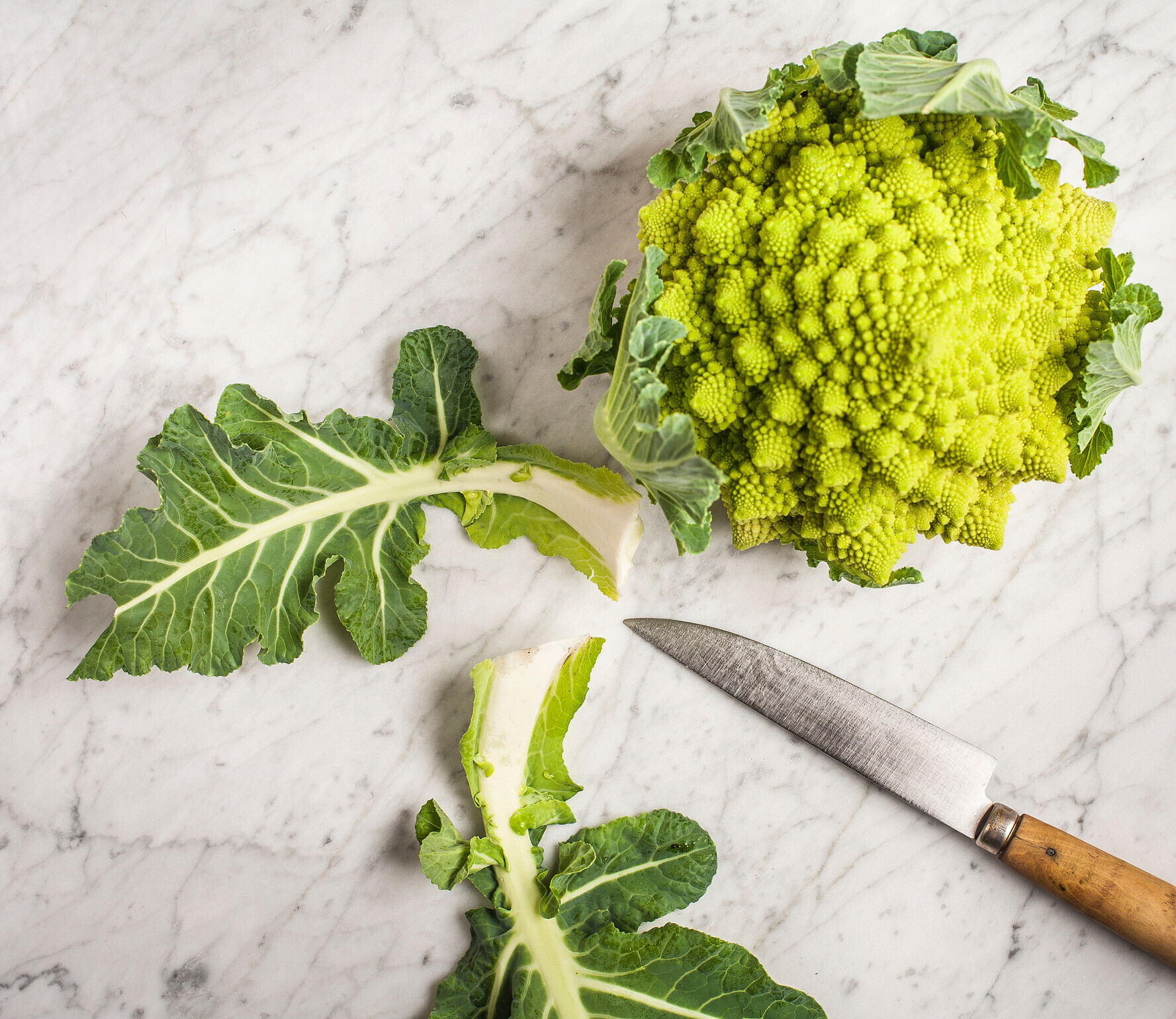
What is Romanesco?
Romanesco is a collection of tools and patterns for building websites. It integrates a front-end pattern library directly into a CMS, which means it generates visually appealing, production ready web pages out of the box. It aims to combine various best practices like code reusability, iterative development, a content-first approach and responsive content editing into one coherent ecosystem.
To explore what all that means, let's slice a Romanesco in half.
Stand-alone CMS
The first half consists of a preconfigured CMS installation (MODX), some preinstalled extras, and styling assets for displaying the website in a browser. This a one-time setup (sometimes called a boilerplate) which can be customized after installation.
Reusable patterns
The second half includes a pattern library with a set of templates, layouts and common website elements. You can use a drag&drop editor (ContentBlocks) to create content with these elements. The patterns can be updated inside each project.
This means that each Romanesco project is a separate installation. And bug fixes, improvements and new features are portable between installations.
Why? Many websites are remarkably similar nowadays from a technical perspective, but in the end each project is still unique. With Romanesco, I tried to find a balance between not reinventing the wheel all the time, while still being able to create exactly what is needed.
This would not have been possible without the CMS that lies at the heart of Romanesco: MODX.
Meet MODX
If you have experience with other CMSes, then you might be familiar with the struggle of rendering your content exactly how you want it to appear.
Things you've seen working elsewhere, or have even designed and marked up already in HTML/CSS, turn out to be nearly impossible to integrate in the CMS. You either need to obey their rigid templating rules, or hack your way through tons of theming and framework layers. The process is ridden with frustration and the result is often not what you had in mind.
In other words: you should be telling the CMS what to do, not the other way around. This has always been the prime directive of MODX. Designers and developers should never be forced to follow any framework dogmas. You should be able to use any tool, technique or library you want.
MODX calls this Creative Freedom. It is characterized by:
- A blank template to start from (you build your own theme)
- No mandatory file structure (you can place your assets anywhere)
- A clear separation of frontend and backend code
- A fully customizable content manager (bring your own RTE)
- X stands for: extend with anything you want
Romanesco builds upon these liberties (in fact, it couldn't exist without them) and respects them by keeping the door open for MODifications and eXtensions as much as possible. So for insiders: this is still the MODX you know and love!
Start with content
Content is arguably the most important part of your website. Yet, many web projects only deal with it at the very end. Not Romanesco!
Romanesco originally started as a prototyping tool. We were trying to flip the development stage on its head by moving the design phase to the end, and start with the content. We'd have a kickoff meeting with our client where we would gather as much info and data as we could.
We then had to structure and visualize that content somehow, so we needed a place where we could quickly dump these content snippets and play around with them. Heavily inspired by the PatternLab project, a base installation was born (using Bootstrap at the time).
We soon realized that putting it directly in our CMS of choice (MODX) had a lot of benefits, especially compared to the wireframing tools we used before. It didn't take long before clients started saying: "wow, that looks great!". To which we replied: "ehmm well, we still need to start the design phase... This is just the prototype (in default Bootstrap styling)."
See! It's all about the content.
Fast forward to today: we have a rock solid CMS, a brilliant block editor, a more flexible UI system, a growing set of common website elements and a fully automated installer at our disposal. This means we skip the basics of setting up a new project and jump straight to the interesting part: customizing it to suit the projects' specific needs.
Build your own web forms, from simple contact forms to complex questionnaires.
| Status | ID | Page | Tasks | Owner | Due date |
|---|---|---|---|---|---|
| 5 | 1 | Create short explainer video | |||
| 4 | 445 | Quick tour | Hugo | ||
| 3 | 446 | Get started | |||
| 3 | 451 | About | |||
| 3 | 476 | ||||
| 3 | 486 | ||||
| 3 | 488 | ||||
| 3 | 505 | ||||
| 3 | 484 | ||||
| 3 | 471 | ||||
| 3 | 485 | ||||
| 3 | 506 | ||||
| 3 | 447 | Notes | |||
| 3 | 448 | View on Github | |||
| 3 | 479 | ||||
| 3 | 480 | Tree Friend Data Sheet | |||
| 3 | 481 | Restoration Agriculture | |||
| 3 | 482 | LimaDOL website draft |
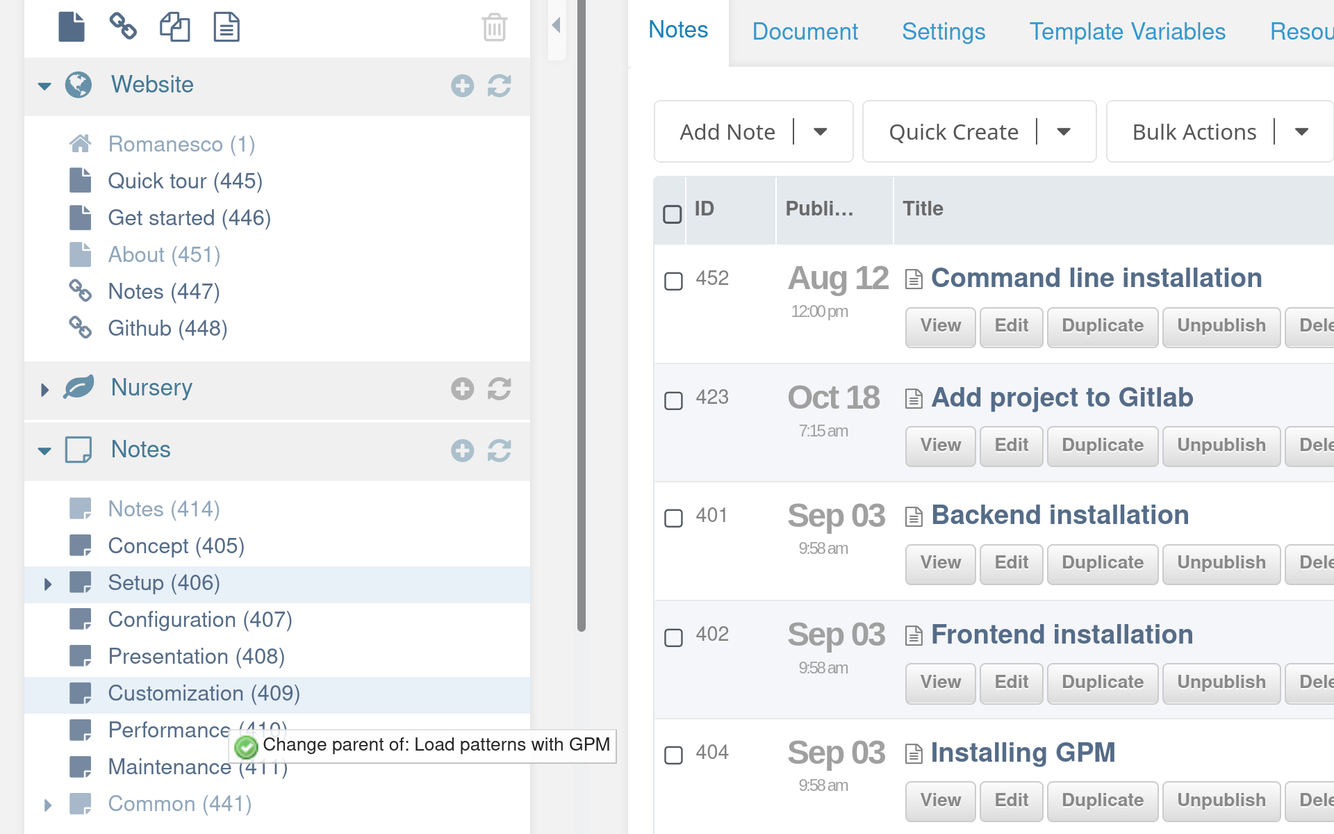
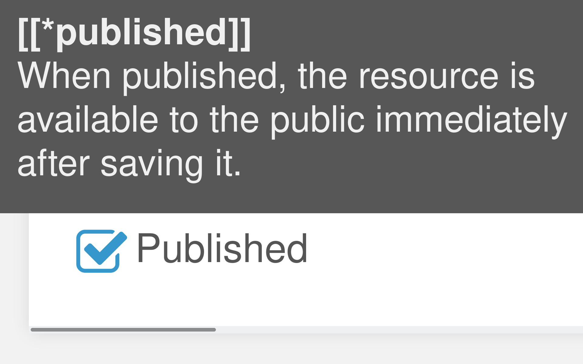
The Status column displays a combination of health and progress indicators. While you are working on a resource, it shows the progress of your editing efforts. And after you mark it as Done, the health indicator takes over, showing the condition that the content is in.
| 1 | This page has a task attached to it Click on the task to see more details | Hugo | 07-07-2026 |
Rows with muted text indicate an unpublished resource. And when the page title text is slanted, then it is marked as hidden in menus.
| To do | The idea is planted, but this page is still empty. | |
| Doing | Work has begun. Leafs are starting to appear. | |
| Review | One last check, before it can be published. | |
| Done | Time to let it grow. Let's move on to the next one. |
| Healthy | This page came out well. Nice work. | |
| Fruiting | A shining example of what we want to achieve. | |
| Buggy | This page attracts more problems than visitors. | |
| Wilting | The content is outdated or has outlived its purpose. |
Keep an eye on the condition of all your pages.
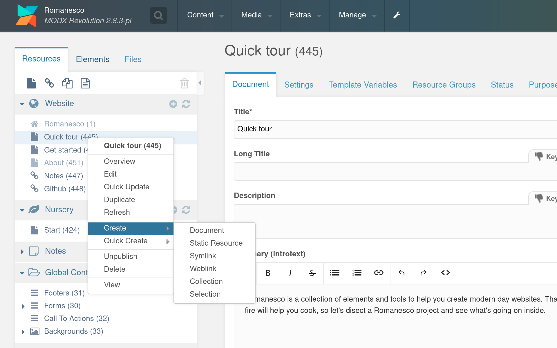
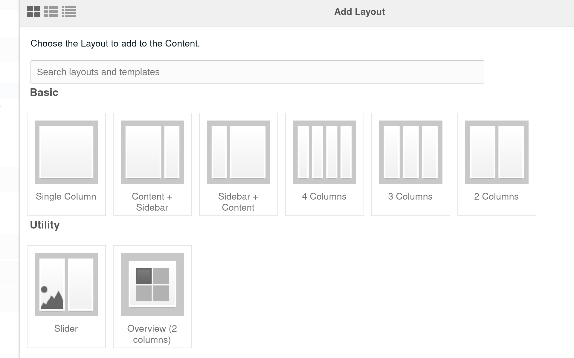
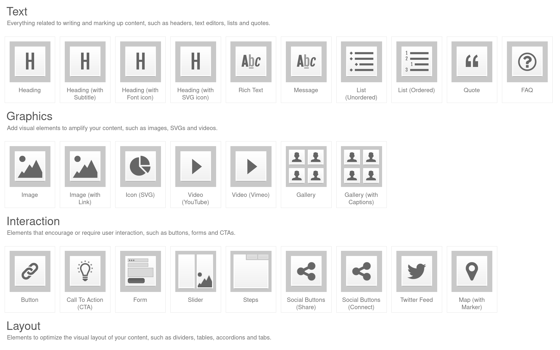
Overviews
An Overview in Romanesco is a collection of related pieces of information, displayed in a list or grid (or slider, or selector...). It is an introduction to content that is located elsewhere on the site.
A good example of an Overview is a list of blog articles. You can display the latest articles on your homepage, which link to the Detail page in your blog.
What can you do with an Overview?
- Use templates to display different variations (i.e. with images)
- Set the amount of columns (with additional responsive controls)
- Control heading level for SEO
- Sort options and limit number of items
- Show pagination after X number of items
And many other things. Overviews are the information desks inside your website. Where the main navigation is meant to quickly get you to a specific location, Overviews provide a little more insight into what your website is about while you are browsing.
Electrons
Electrons function as a bonding mechanism for atomic systems
Atoms
Moving up to the level of atoms, things are still very much generic
Molecules
Molecules are slightly more complex, but they can't function on their own
Organisms
The outlines of a module appear when dealing with an organism
Example of an overview. The content in these cards is fetched from the information fields on each page.
Responsive design
It's probably impossible to create anything on the web nowadays without considering responsive design. As web builders, we are responsible to make the site work across a range of devices.
Romanesco helps you to choreograph your content a little, so it comes out nicely on any screen size. It also takes care of a few things automatically, following responsive design best practices.
- Compact / touch friendly navigation on mobile
- Start stacking content as the screen gets smaller
- Simplify layout elements on mobile (like turning tabbed content into accordions)
- Keep font sizes and white space balanced across breakpoints
- Load smaller images when screen is smaller or has lower pixel density
Benefits of using a central library
Anyway, you know this stuff already. The thing with responsive design is: it can take a long time to get it right. Endless fiddling with CSS, build tools, testing in different browsers / devices, etc. etc. And when you discover a bug in your approach, you sometimes find yourself fixing it over and over again in various places.
Maintaining a central repository with responsive design elements still requires a lot of work. But ultimately, the benefits are well worth the effort (if you ask me). Just think of all the work (and frustration) you save when everyone is using components that have been tweaked and tested over an extended period of time. Because bugfixes and improvements can be applied to all your projects, the quality and usefulness of your responsive design elements will continuously increase.
On top, an example of a responsive image gallery. If you change the width of your browser window (or visit this page on another device), the gallery turns into a slider.
These tabs would quickly run out of space on smaller screens. That's why they are displayed as an accordion instead. Same content, different presentation.
Follow Romanesco
Receive information about the project in your mailbox.
The mailing list is called Fractal Forest and sent by Fractal Farming.
Theming
Romanesco doesn't offer a ton of different themes. Instead, you get 1 theme with a ton of customization options.
You can control some of these options yourself (from inside MODX), like color scheme, fonts and logo. And you can ask any webdesigner to help you with tweaking the theme to further fit your identity, or dive into the mechanics yourself if you feel adventurous.
The theming framework relies on FomanticUI and allows you to apply customizations per component, and on different levels in your design. That sounds a bit fuzzy and in fact: it probably is a bit intimidating at first. But essentially, what you end up with is a fully customizable design system.
Theming structure Fomantic UI
#698f73
Primary color (Dark)
#5f7ebe
Secondary color (Dark)
#eaf3ec
Primary color (Light)
#edf1f8
Secondary color (Light)
Light
Grey
Dark
Transparent
Performance
Together with bandwith and possibilities, the complexity of the internet has grown immensely over the past 20 years. The same cannot be said for the average human attention span.
Fast loading times and snappy interactions are therefore crucially important for online survival. Romanesco has a few (optional) mechanisms built in for improving site performance. Some of these measures (like critical CSS) are only intended for medium to large web projects, where competition is fierce and every milisecond counts.
Custom caching
By default, MODX clears the site cache every time you save a page (even something small like a fixed typo). After that, a lot of content needs to be regenerated from the database, resulting in slower page loads. Thats why some parts of the cache have been moved to their own partition, so they won't be cleared on every save action.
Cache busting
When you intentionally cache static assets in the visitors' browser, changes to these files won't be visible on return visits, unless the filename is different. The cache buster takes care of this. When static assets like CSS or Javascript are updated, they receive a new suffix so the client browser will treat it as a new file and download it again.
Critical CSS
When enabled, a CSS file will be generated for each resource, containing only the styles needed to display content above the fold. This file is usually much smaller than the main stylesheet and loaded as early as possible. The main CSS file can then be loaded asynchronously, resulting in a substantial performance gain.
Image optimization
You can preload important assets, remove unused CSS and load your Javascript asynchronously until your site weighs an ounce, but all those optimizations are meaningless if your images are not being optimized as well.
One JPEG file can easily outweigh your main CSS file. And where the CSS file is cached after the initial download, your visitors will probably need to download different images for every new page they visit. To make matters worse: large screens (and/or screens with a higher pixel density) require much more pixels for an image to look sharp. And more pixels means more bytes.
To deal with these issues, several optimizations are applied:
- Images are lazy loaded (only downloaded when they're about to be displayed)
- Images are automatically scaled down into different sizes
- The most appropriate size is loaded, depending on screen size, pixel density and the width of their container (yes, that was quite a challenge)
- A WebP image is generated, which is often much smaller than the JPG or PNG file they're replacing (and without loss of quality)
- Provide options for thumbnail image quality and HiDPI / Retina optimization
Check the adjacent image, to see how it behaves responsibly on various screen sizes.
Additional in-depth guides to this process can be found here:
Optimize image thumbnails
Create and serve a WebP version, with optimized JPG/PNG fallback.
Set longer cache lifetime
The infamous pagespeed recommendation.
Original filesize: 1239.1 KB
| Screen width | Image dimensions | Image size |
|---|---|---|
| 320px | 584x329 | 12.66KB |
| ~ 320px | 772x434 | 17.94KB |
| ~ 392px | 916x515 | 21.87KB |
| ~ 462px | 1024x576 | 24.95KB |
| ~ 528px | 1112x626 | 27.21KB |
| ~ 560px | 1200x675 | 30.38KB |
| ~ 600px | 1366x768 | 36.11KB |
| ~ 682px | 1600x900 | 43.69KB |
Around > 772px, the viewport switches to 2-column desktop layout, after which listed images are reused. And as a side note: these values are from a high density display, meaning the images are displayed at 2x the display resolution.
That wasn't exactly quick, was it?
By now I hope you have a rough idea of what Romanesco is. It's hard to explain, because it's so broad. It's a system, and a system is often more than just the sum of its parts. Romanesco for me has become a way of doing things. It provides me with structure and stability, without becoming too rigid and dogmatic.